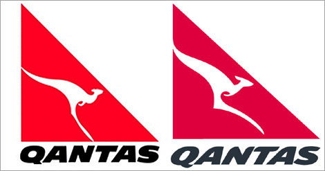
Lots of negative media about the new Qantas logo.
Personally, I quite like. It’s kept the existing corporate identity, simply brought it up to date… more modern, streamlined… its Qantas 2.0 if you like.
It will look brilliant on their new aircraft… well done Qantas on moving with the times.
